I was utterly lost when PowerPivot for Excel was first described to me. Being a budding student of traditional data warehousing, the idea of using Excel was scary. What does that tool do exactly? How could that be useful? How could an Excel add-in actually provide value? The answers I would learn in the coming months have changed my perspective. PowerPivot has quickly become one of my favorite tools, and with the recent upgrade, it’s getting even better.
I have been wracking my brain to find an easy way to explain exactly what PowerPivot is and what it can do. So I came up with this article and a practical, real-world example of how using it can be really fun. I have included pictures of almost every step.
I am using the newest version of PowerPivot with Excel 2010 (required). It can be found here.
The Situation
I am a music lover, just like everyone else. I listen to a ton of music. I always thought it would be neat to see if there are patterns in my listening habits that could be viewed by visualizing data.
Last year I started using last.fm to keep track all the songs I have listened to. I had an idea the other day: what if I extracted all my listening data, appended genre information, then used this “pile” of data to see trends?
Let’s Get To It!
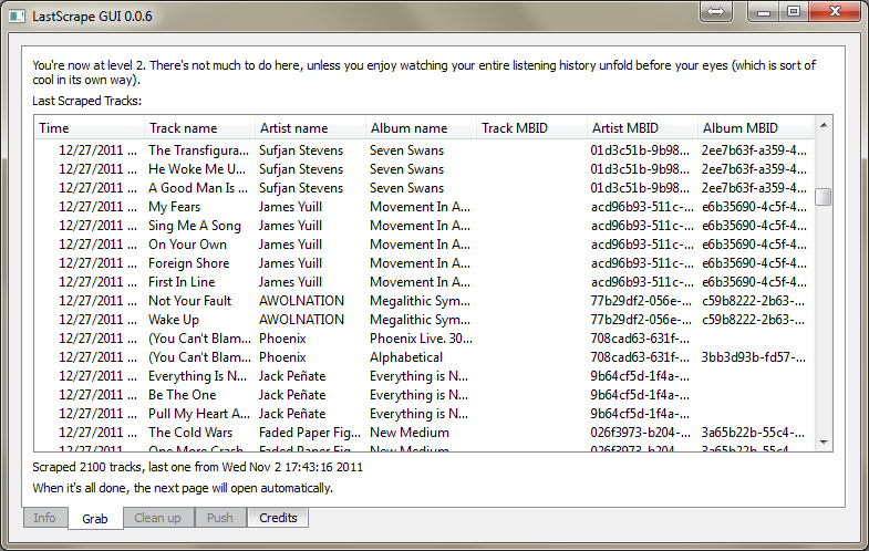
Step 1: I first find a program (LastScrape) that uses last.fm’s API to extract all my song plays. You can see here the program churning away pulling one row per listen. I notice that there are some unique identifiers for the artists in this data set. This will be very useful when I attempt to augment this data from other sources.
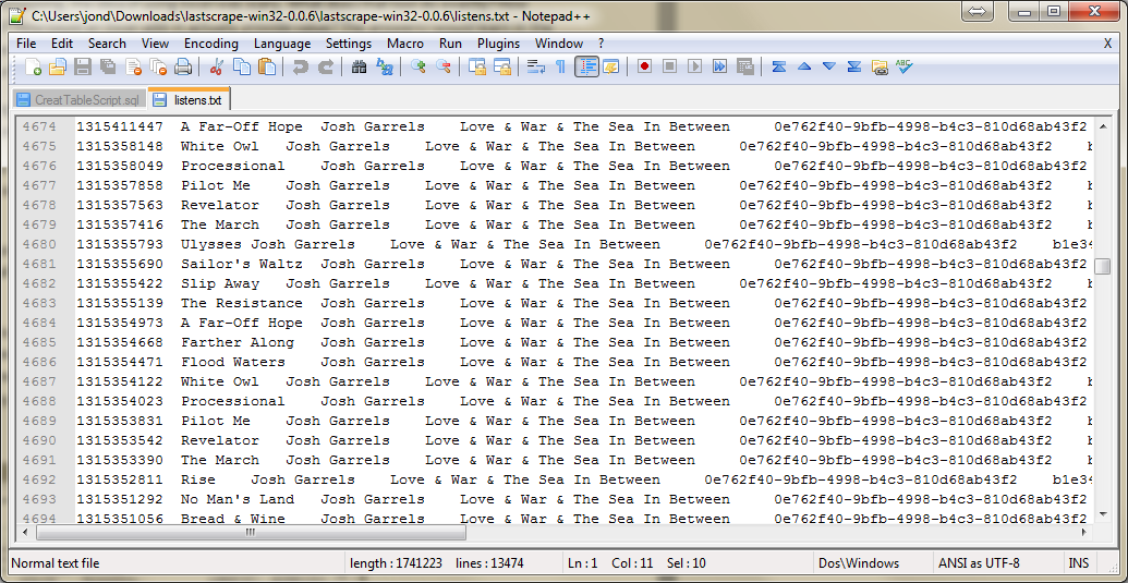
Step 2: I then open the text file that the program generated in the ultra-useful Notepad++ to check out the structure. Here I notice that the date and time stamp was in Unix time, which displays the number of seconds elapsed since 1/1/1970. I will have to special handle this to get it formatted as a normal date and time. Thankfully, PowerPivot has just the solution for that. Also, sometimes a text output like this could have the first row be the data labels (or headers). This particular file had none, which was not a big deal.
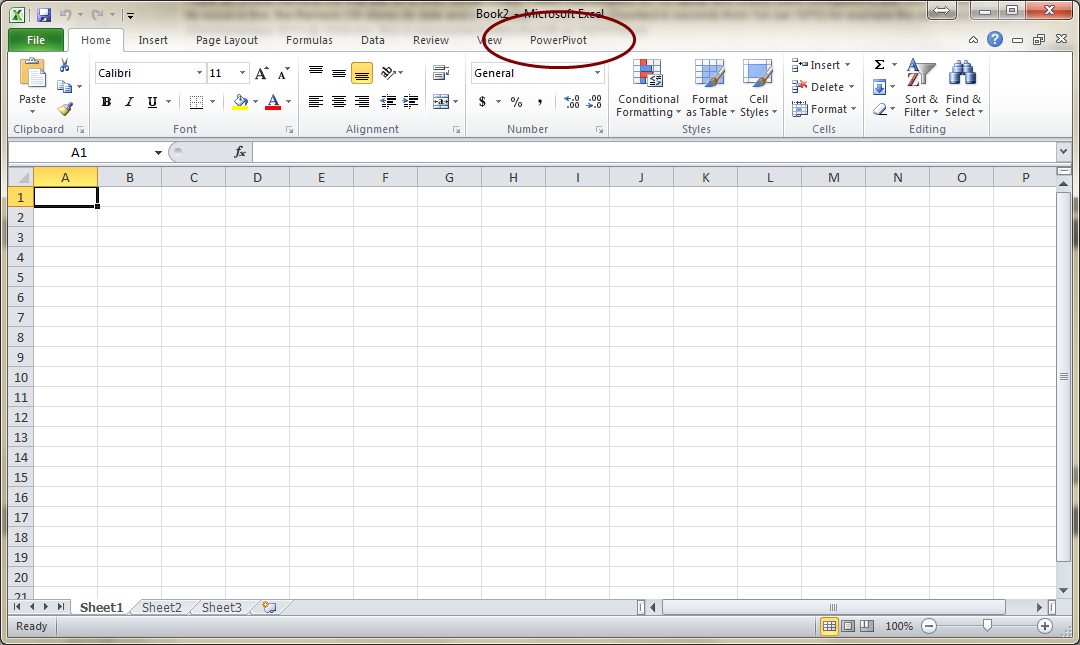
Step 3: At this point I fire up Excel with PowerPivot RC0 and click on the PowerPivot tab in the ribbon.
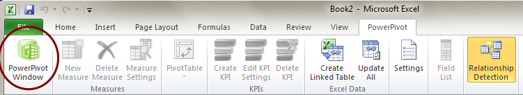
Step 4: In the PowerPivot tab I click on the PowerPivot Window button. This is where most of the back-end data will be stored and managed. You can think of the PowerPivot window as the data preparation area, whereas your normal Excel window is the data presentation area.
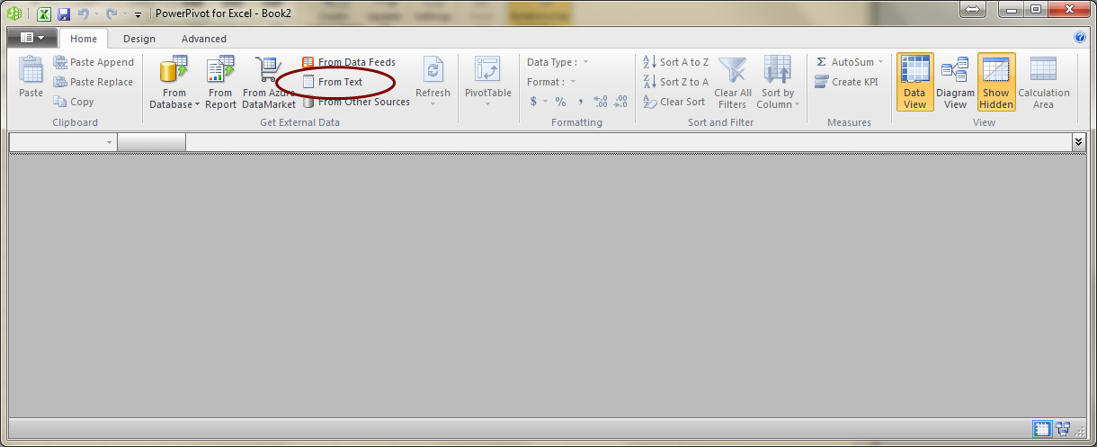
Step 5: In the PowerPivot window there is a Get External Data section on the ribbon. This is generally your first place to start when bringing data into PowerPivot. In my case I am getting my data from a text file so I click From Text.
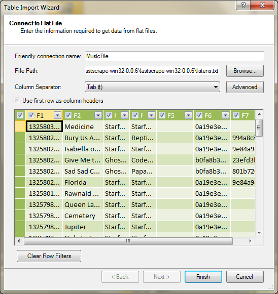
Step 6: I then browse to the location of the text file and change the Column Separator (delimiter) to tab. In this window you can preview the data before it is imported. PowerPivot automatically names the column F1, F2, etc. if there are no column names available. More on that later.
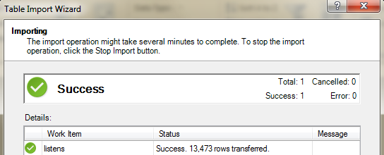
Step 7: Once everything looks satisfactory, I hit the Finish button and it imports all 13k rows
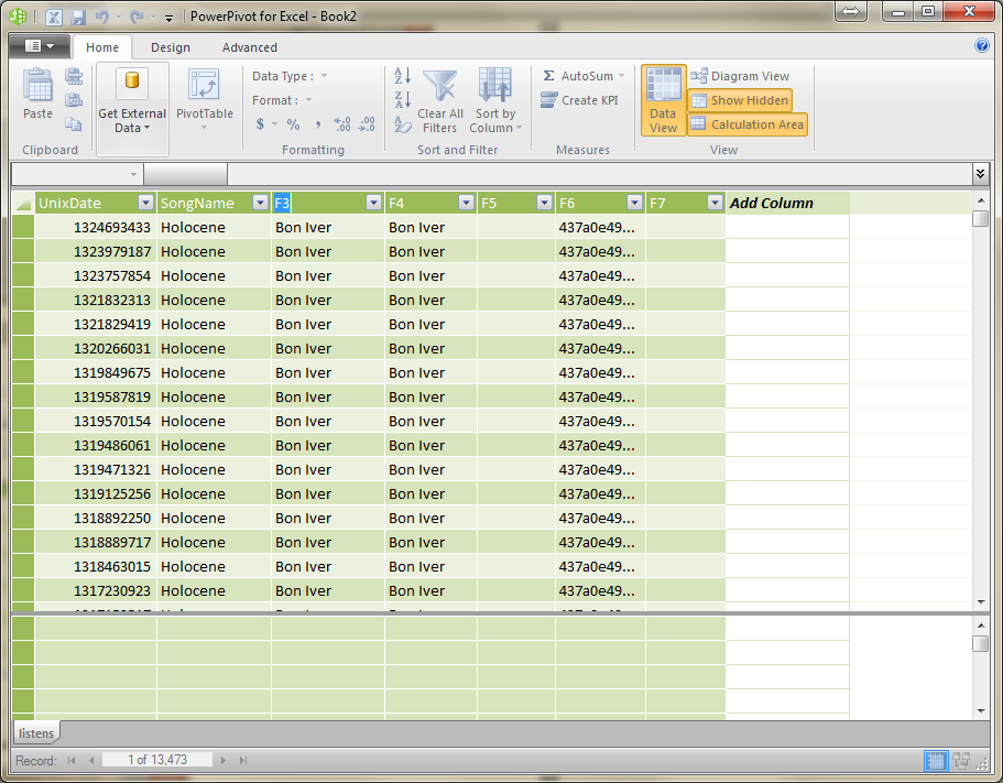
Step 8: Since the text file I imported did not have column headers in the first line, I manually change the column names by double clicking them as shown above.
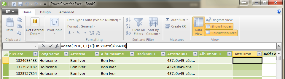
Step 9: At this point I want to convert the Unix time to a normal date and time. This would be the perfect time to introduce “calculated columns”. A calculated column is a new column that is appended to your table that calculates itself based on a DAX expression for each row in the table. To add a calculated column I double click on the Add Column and arbitrarily name my new column DateTime. In the formula bar I type in the following DAX formula: =DATE(1970,1,1) + ( [UnixDate] / 86400 )
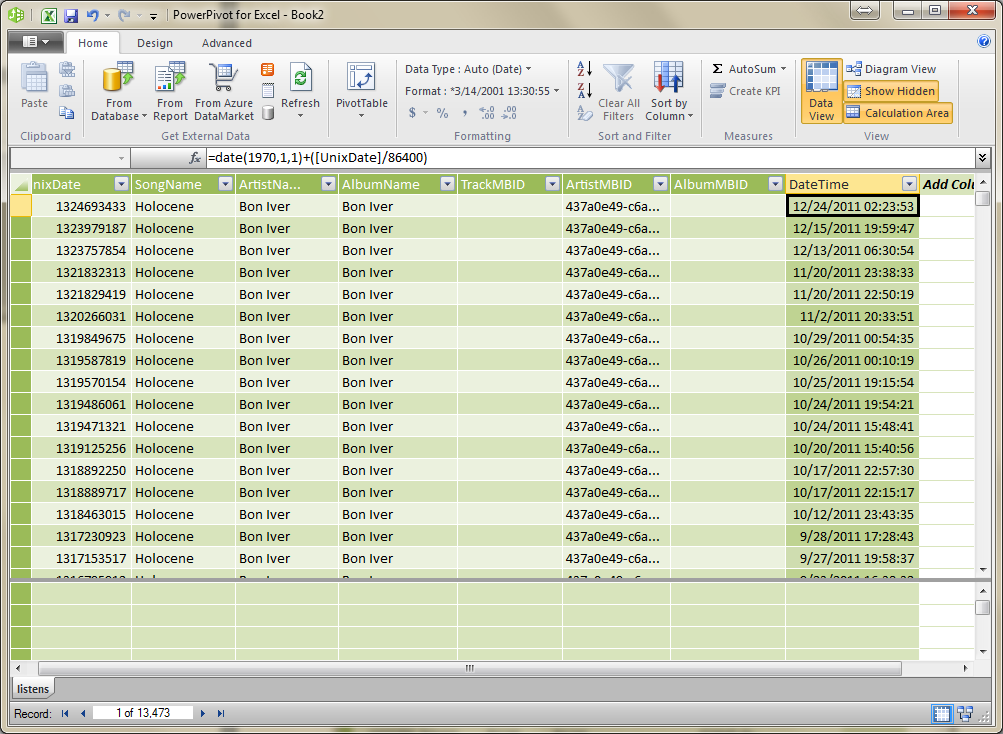
Step 10: After pressing ENTER, the UnixDate column is converted to a normal date for each row in the data. For your information, there are 86400 seconds in a day. Since Unix time is the number of seconds elapsed since 1/1/1970, we can add the (UnixDate / 86,400) to the DATE function for 1/1/1970 and get the correct date time value. This new calculated column is treated as a normal column in the Excel side. More on that later.
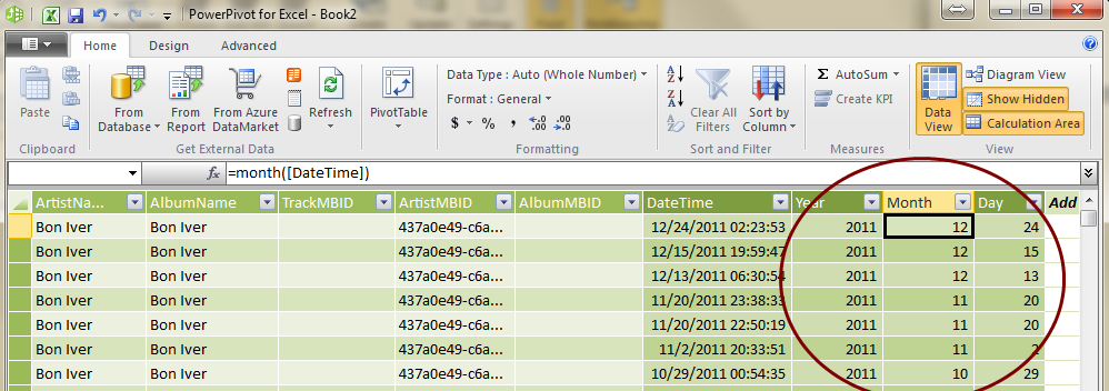
Step 11: I then add three more columns based on our new DateTime column named Year, Month, and Day. These new calculated columns facilitate easier data analysis. This shows that you can actually chain calculated columns off each other. I use following DAX expressions:
a) YEAR( [DateTime] )
b) MONTH( [DateTime] )
c) DAY( [DateTime] )
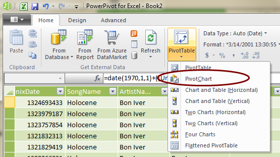
Step 12: At this point the data is prepped and ready to be analyzed in the “data presentation” side of Excel (the normal Excel window), so I click the PivotTable button and select PivotChart.
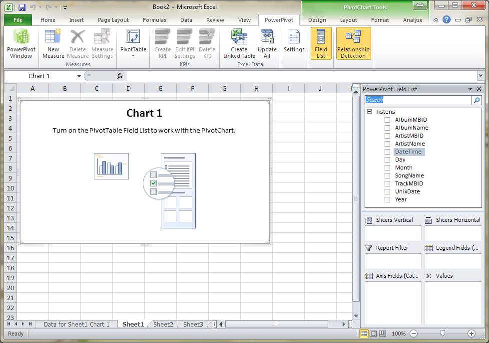
Step 13: When I create a PivotChart from my PowerPivot data, a PivotChart and a PivotTable are created on separate sheets.
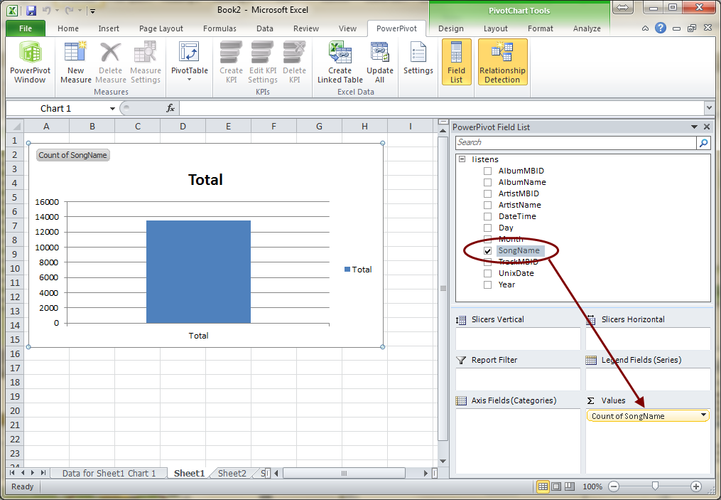
Step 14: As one of co-workers correctly taught me, the first question to ask when analyzing data is: “What am I measuring?” In my example I would like to measure the count of songs I listened to. You could potentially do a sum, count, min, max, average, or distinct count. To do this I drag SongName in to the Values section as shown in the above image. Excel automatically guesses that I want to count the SongNames. This is basically returning a count of the rows; I could have counted any of the fields.
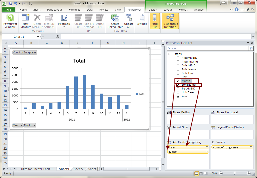
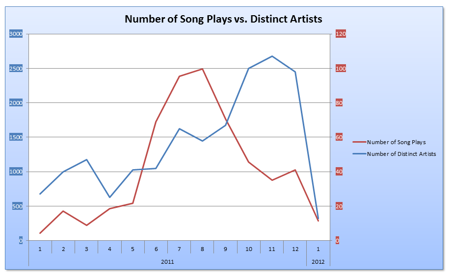
Step 15: I would like to see the Count of Songs by Months and Years so I drag the corresponding fields into the Axis Fields (Categories) section as shown. At this point, I have already created something useful that begins to give me some insight into my music listening patterns. For instance, I quickly notice that in August I listened to a TON of music. This happens to be the month before I got engaged, which makes sense. What doesn’t make sense is that my fiancée is crazy enough to marry a guy who writes blog posts on Excel…
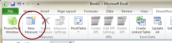
Step 16: Now that we are starting to visualize the data in meaningful ways, more questions pop into my head. I wonder how much variety there is in my music choices… I think that could be answered if I could see how many distinct artists I listen to by months. Allow me to introduce to you Measures. Measures are added to your PowerPivot data from the Excel side of things via the New Measure button in the PowerPivot tab. Measures allow you to further supplement your data. With the combination of measures and calculated columns, we are able to efficiently achieve most any analysis you can think of. As a matter of fact, the Count of SongName is also an automatic measure that was generated when we dragged SongName into the Values area.
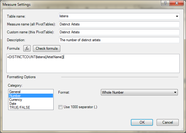
Step 17: In the Measure Settings dialog box I types a name for my new measure and called it Distinct Artist. This is the name that will appear in the PowerPivot Field List on the right of the screen. In the Formula section I wrote another DAX expression that counts the number of distinct artist names. I then set the formatting of the result to a whole number at the bottom of the dialog box. That’s it! PowerPivot is smart enough to figure out the rest. Here is the DAX query that I wrote to distinctly count the ArtistName column in the listens table:
a) =DISTINCTCOUNT( listens[ArtistName] )
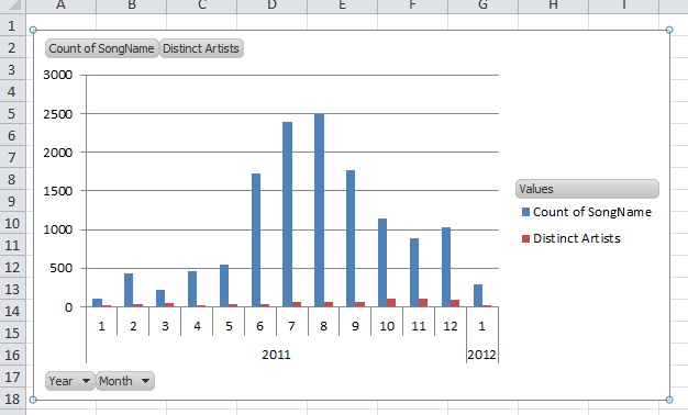
Step 18: The new measure is automatically added to the Values section and shows up as a new series in the chart.
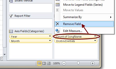
Step 19: Since these two measures don’t really work well on the same axis I am going to remove the Count of SongName measure. I do this by either dragging the yellow bar off the field list, or by right clicking and hitting Remove Field.
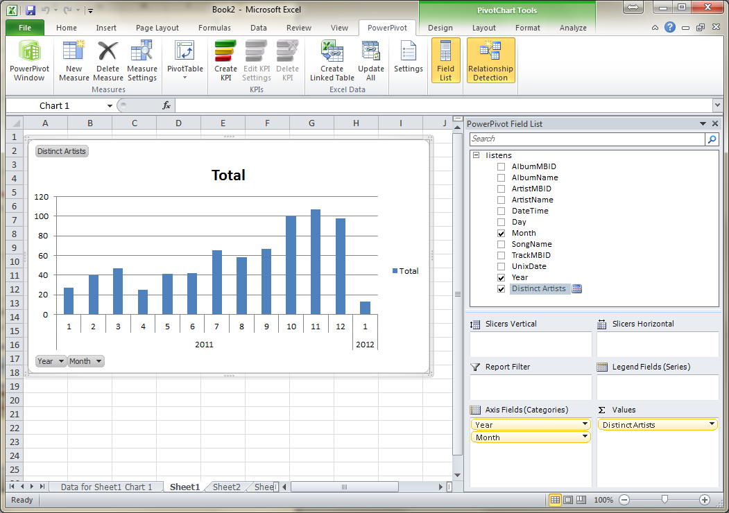
Step 20: Now we have a bar graph showing essentially how much variety there was in each month.
What Next?
At this point the sky is the limit to how I want to present the data and what I can do with. In later posts I might cover some things that can be done with this dataset such as:
• Creating dual axis charts and making things consistently “pretty”
• Uploading the workbook into SharePoint and scheduling data refreshes
• Using KPIs to make dashboards
• Using the new PowerView from SQL 2012 in SharePoint from this dataset (my personal favorite)
• Augmenting the dataset with other datasets from the internet
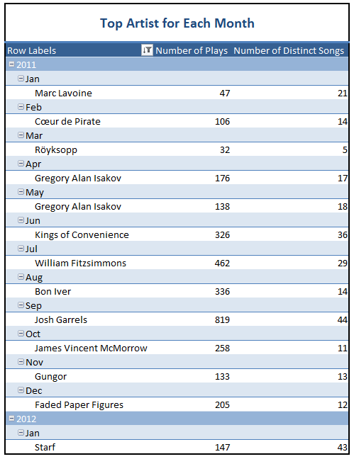
For the time being, take a peek at this chart and table I made in a few minutes. It’s really easy once you have the dataset imported and your calculated columns and measures setup. If you are interested in learning DAX, check out this download that includes a sample PowerPivot file.
Until next time.
-Jon